Thursday, December 16, 2010

Final Illuminated Letters

Description

This project is basically centered around creating an "illuminated letter" or "drop cap." The Illuminated Letter was something used frequently in Middle Age texts. Today, the drop cap is often seen in magazines or websites. The project involved mimicking the design of a favorite artist (or three) and using their style to create an interesting and legible letter. How can one express an artist's characteristics using a canvas the size of a letter? A 3 x 3 " letter no less.


Overview

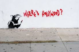
The challenge of creating something similar to an artist you admire is complex: You must balance your own style with theirs, making something original that is at the same time yours and theirs. I found that the challenge definitely depended on the artist, because some artists are more difficult to emulate. I found that my high school doodles were pretty similar in feeling to H. R. Giger's work, so his portion was the most easy. Steadman, was probably next easiest, because his sketchy quality, while not like mine, is something I can easily appreciate and understand. The most difficult for me was Banksy, because I personally I have never made a spray paint stencil, found a spot, and spray painted it onto a wall. So, it involved more imagination and exploration.


Progress

Below, you will see my progress that lead to the final design. Some of the progress obviously ends quickly, but other times, innovation leads to success. I believe that the choices behind the final designs were they best possible but the entire process allowed for a thorough exploration of the concept. So that, while a concept might not have been chosen, it was still important in itself.


Sunday, November 28, 2010

3 Artists with Color Schemes and Word Lists

Banksy:Stencilly, progressive, anti-government, Britsh, humorous, graffiti, quick, simple, silk-screen, child-like, rats, hipster-culture, underground, street-art, compelling, quirky, likeable, non-threatening, popular


H.R. GIGER: Methodical, nauseating, Grotesque, goth, disturbing, surreal, unnatural, mechanical, organic, bony, vertabral, desolate, inhuman, bizarre, dark, post-apocalyptic, monochromatic, quiet, bio-mechanical, futuristic, alien, imposing, smooth,


R. Steadman: Splattery, playful, intense, monstrous, dynamic, shifting, crazy, embellished, chaotic, insane, messy, Hallucinogenic, trippy, surreal, demonic, counter-culture,

Final 3 Artists For Illuminated Letter


Get ready for some drama:

A surprise candidate was just announced to take one of the only three spots. Da Da dummmmmm.

I'm pleased to suggest H. R. Giger (The Guy That Draws the Aliens). He's crazy, he's
Swiss, he's an artist.


Also, we have Banksy sticking around. That's gonna be real interesting.


And lastly and leastly Ralph Steadman (The Hunter Thompson Guy).


Wednesday, November 17, 2010

Typography - Getting Close to Finished


I have a few changes planned for these posters and after those changes have been made I'll be almost done entirely, save for printing and mounting and delivering and stuff.

You might not be able to read very much from the posters but the gist is the typeface (Rotis Sans) and the creator of the font (Otl Aicher). The poster regarding the font points out various important characteristics that define the font. The poster regarding the person has about 500 words over his life and about 500 over the history of the previously mentioned font. The characteristic poster also has some German to it, because the designer was himself a German.

The final product will be 22 x 34'' - each

Wednesday, November 10, 2010

Saturday, November 6, 2010

The Ascent

I finally got "The Ascent" downloaded and watched that. It was very interesting and while "interesting" is a very generic word I still think it was that. When you look at it through the Soviet propaganda perspective it makes a lot of sense because of the themes of loyalty to the Motherland and the pain that traitors must suffer for their weaknesses.

I was a bit disappointed because I thought the movie would have a broader scope than that (probably because I am used to American movies, like "Enemy At The Gates") but because this movie works on a smaller scale it is able to provide a more in depth analysis of those topics.

I'm still seeding the movie and it seems like people are downloading it, so maybe some of my classmates are going my route.

So far I have checked out "Badlands", "Playtime", and "The Ascent" but on Sunday I might check out the other two. I guess today is Sunday.

"Playtime" was pretty unappealing as a movie, actually. Although, there seems to be good design potentials here.

Also I am posting an image of some clouds I made to go on my video, at the end actually. So I will be finishing that up today also. They are scary clouds.

Thursday, November 4, 2010

Badlands Down, Four More To Go

Watching movies takes time. I have to fit in my schedule which is full of me watching other stuff. I've got "Badlands" done, but I'm still way behind on watching these movies. I think I can knock out "Playtime" tonight and maybe one or two tomorrow. Finding "the Ascent" hasn't been easy and I forgot to order it on Netflix. Anyway, I think I can find it on the InterOMG THE FBI!!!11!


Monday, November 1, 2010

Weather Demo (Rough Draft)

This is the first draft with motion for my Weather Video. This is from last week and many new changes are already on the way.


You can also see the movie on Youtube.

Wednesday, October 27, 2010

Posters Is Here

I'm steadily making progress on my posters and I think they are coming along nicely. The best part about spiders is that they are very recognizable. People are almost hardwired to recognize them, it seems.

Friday, October 8, 2010

Spider Poll is Now Up

Have fun voting. Of course, it's anonymous so get those phobias off your chest*.


*this site is meant for entertainment only. Not intended as a replacement for psychiatric help for arachnophobia or any phobia.

Tuesday, October 5, 2010

TYPEFACE: Movie From Class


The documentary we watched in class on Monday was mainly focused on the impact that letterpress has (or had) on industry, society, communication and art. While its influence has mostly wained it is still a viable tool for those wishing to express an idea or message typographically.

The film focused a great deal on a town that was at one point very prosperous because of the importance of wooden type at the time. All that remains of that factory is a museum where a handful of locals (and the infrequent visitor) spend time amongst the wooden blocks and presses. There are a few locals remaining that still remember how to operate the machinery and how to create new blocks, but these people are in their 80's and there aren't any young people lined up to learn this trade.

We learn that woodtype was a huge business when it was one of the only ways to print, especially if you wanted to print something that was very large, like an outdoor poster. The cost of making a wooden stamp was tiny compared to one made of steel. The factory in Hamilton supported a whole town just by printing. In the 60's, we're told, offset lithography takes over and wooden printing business takes a nosedive.

Until recently no one cared at all about letterpress. However, lately there has been something of a renaissance in this method of print. It has become trendy within the art scene to embrace the uniqueness and hand made quality of a print made from a wooden block. There are defects and designs the wood creates that wouldn't be easily possible to make on a computer, certainly not if it were to be convincing. With each letter sitting on a different block the amount of variety between one and the next beats any computer font. In a time of digital immediacy, something that actually takes time to make becomes more valuable, which is good news for letterpress.

The film seems to suggest that it is possible that there will be a real reemergence of letterpress based on the level of interest that we see now, but while there is interest will there be enough to sustain the movement to the point of becoming mainstream? And if so, will it lose its charm and quirkiness and fall back out of the attention of the populace? I suppose we'll have to wait and see, but I think that there will always be some individuals that will hold onto this old school technique.

Monday, October 4, 2010

Otl Aicher - Font Designer Biography


Otl Aicher was one of several leading German graphic designers during the twentieth century. He was born in Ulm, Germany in the year 1922.

He was a friend and classmate of Werner Scholl. Through this friendship he met Werner’s family which included his siblings Sophie Scholl and Hans Scholl. These people (Hans and Sophie) would be eventually executed in the year 1943 for their membership in the White Rose movement, which was a resistance movement during World War Two against the Nazi regime in Germany.

As the Scholls were, so was Otl Aicher in that he was against the Nazi movement in Germany at the time. This sentiment was very strong. He was actually arrested in 1937 for refusing to join the Hitler Youth and was therefore automatically considered having failed the Abitur. The Abitur is a college entrance exam in Germany and is very important in a young student’s life. Later, he was drafted in the German army to fight in the second world war despite his views towards the whole thing. He tried to leave occasionally, at various times but was unsuccessful in doing so. Eventually, in 1945 he was able to desert from the army and took residence in the home of the Scholl’s which is in Wutach.

After the war, in 1946, Aicher began to study sculpture in Munich at the Academy of Fine Arts Munich. In 1947, he made the bold step of opening his own studio in his hometown of Ulm. On a side note, he married Inge Scholl, the more fortunate of the Scholl siblings. Not too long after this he, along with Inge Scholl and Max Bill, founded the Ulm School of Design. This school became one of Germany’s foremost teaching and learning centers for design. They were most influential during the 1950’s and the 1960’s.

In a career defining move, he was able to contribute considerably in the corporate branding of Lufthansa Airlines in 1969. Along with his general input he was also in charge of designing the logo for Lufthansa Airlines.

Despite the significance of designing the logo for an entire airline, he landed another great designing gig a few years later when he was selected as the lead designer for the 1972 Munich Olympics. As part of his work on this project he created a new set of pictograms that eventually would lead to the ubiquity of stick figures in daily life. These now omnipresent and easy to understand stick figures were once actually ground breaking in design, and we can thank Otl Aicher for that. Not only did he bring stick figures into the minds of the modern pedestrian and motorist, he also developed the first Olympic Mascot. This was a dachshund named Waldi who sported stripes.

Farther down the road, in 1980 Otl Aicher was employed as a consultant of the kitchen company Bulthaup. And also during the 80’s (1988 to be specific) he created the wonderful and oft used font “Rotis Sans” which he named after the domicile of Rotis in the city of Leutkirch im Allgaeu.

He died on September the first, 1991.

Rotis Sans


Rotis is a typeface developed by Otl Aicher, a German graphic designer and developer of typography, in the year 1988. By developing Rotis, Otl Aicher set out to create a font with maximum legibility by using a uniquely and highly unified, and also varied, typeface family that can fit itself to the right context. Otl Aicher wanted to create a family of fonts which could serve nearly any typographical purpose, so that, for instance, Rotis could be used on a street sign but also a company letterhead or even stand as a logo itself.

Basically, the Rotis Typeface Family is as unified as it is diverse. Rotis can vary from full, glyphic, and sans serif. There are at this time four basic Rotis variants which include Rotis Serif (antiqua), Rotis Semi-Serif (semi-antiqua), Rotis Semi-Sans (semi-grotesque), and finaly Rotis Sans (lineale humanist sans serif).

Rotis serif has full serifs, while Rotis semi-serif has only hinted serifs. Additionally, Rotis semi sans has no serifs but It does have stroke width variation while again Rotis Sans has no serifs and with very little variation on stroke width.

The name of this particular typeface, which again was developed by Otl Aicher, is based on the name of a city. The name of the typeface comes from the place name Rotis, which is a quarter of the German town Leutkirch im Allgaeu. The significance of this place for Otl Aicher is clear because this was the place he was staying when he developed this well-known font. As opposed to the actual geographical place, the typeface of Rotis was initially written in all lower case letters because Otl Aicher thought of capital letters as a sign of dominance and oppression and hierarchy. This today is all but forgotten because, since the fonts were reissued by Monotype Imaging, the font names have be capitalized. Part of the fallout from this change was also affected fonts published by downstream foundries.

For someone or some company interested in exploring Rotis for themselves or their products, they would be able to purchase this font for $367.00. That would be in United States Dollars. So with its inherent versatility and it’s relative affordability one should expect to see one of the Rotis family fonts just about anywhere.

Notable uses of this font are too numerous to list, but a few of the more important examples would be:

Björk, the Icelandic musician known the world over for her quirky personality used this font for the artwork of her album Homogenic and all its corresponding singles. Björk was also in the band “the Sugarcubes” which preceded her much more successful solo career.

Another significant usage of Rotis would be by the German kitchen company Bulthaup, which incidentally employed the creator of Rotis Sans, Otl Aicher.

The Easy Asian country Singapore uses this typeface for their highway and street signage. Several other cities across the world use this font, but Singapore is the only country which uses Rotis in the fashion.

Bibliography

Rathgeb, M. (2006).Otl Aicher.New York, New York. Phaidon

Hofmeister, S.(2007, May).Rotis und der rest der Welt. Baumeister, 104,44

Http://en.wikipedia.org/wiki/Otl_Aicher

Http://en.wikipedia.org/wiki/Rotis

Monday, September 27, 2010

Movie Poster

I found this movie poster on rottentomatoes.com.

I think it is an interesting use of typography and it creates a sense of depth.

If you are interested in watching the movie... I think it has received good reviews.

Tuesday, September 21, 2010

Behance Invitation


When I applied for my membership at Behance I was surprised they didn't want to know more about me. I tried to call them and request an extension on the allowable number of characters, but it didn't work out. I will mail them my additional information along with a headshot and pictures of me and my dog and my sketchbook.

This is what I put in my request for membership form at Behance.net:

"Currently I am a student at the University of Kansas. I am a sophomore in the Graphic Design Program.

Much of my current work output is related to school because of the nature of the coursework. My work from school is currently comprised of graphical sketches that establish the basics of an object to make it simple but recognizable. Also typography.

My personal work is comprised of a wide range of mediums, but most recently I have been working on developing an alternative comic strip series.

Tuesday, September 14, 2010

Ten Typography Tips


This is a good place to look for some basic tips on typography. This mainly deals with web design, but I think it is still applicable:

Wednesday, September 8, 2010

Univers and the Univers Grid


Univers is unique because of the extensive variety of forms it has as variations. From heavy to thin, Univers covers a wide range which makes it very useful for a plethora of applications.

The numbering system sets Univers apart as well. Adrian Frutiger tried to simplify printing by giving his creation a system. An important step in creating a unified system.

Because it has been around since the 50's it is also been influential not only within Adrian Frutiger's work but others as well.

The grid allows Univers to be viewed in logical steps of variation. This can make the finding of the right font easier.

Adrian Frutiger


Adrian Frutiger

Adrian Frutiger is a well-known typeface designer from the 20th century and continues to be one in the 21st century. Born in Switzerland in 1928, he is best known for designing the Frutiger and Univers typefaces.

He began his career in typography when he was sixteen as the apprentice of a printer in Interlaken, Switzerland. He worked in this position for four years. Later, he was the student of Walter Käch and Alfred Williman. This was in Zurich, Switzerland at the Kunstgewerbeschule.

He found employment in Paris at the Deberny et Peignot foundry based on his knowledge and skill with letterforms. At this foundry he was able to create the typefaces “Président", "Phoebus", and "Ondine".

During the foundry’s creation of a unified font family, Frutiger was an essential influence on the success of their design. He strived for unity and at the same time non-regimentation which led to the highly successful “Univers”. Frutiger would base some of his later work on “Univers” as well.

In the late 90’s Frutiger began to refine and expand his fonts to accommodate screen display. “Univers” was reissued with sixty-three variants and several of his others were updated as well including Frutiger and Avenir.

Frutiger is currently alive and has most recently worked on a limited edition wristwatch face. He also created a wordmark for an institute in India, the National Institute of Design.

(source: http://en.wikipedia.org/wiki/Adrian_Frutiger#Current_work)


Wednesday, September 1, 2010

Lines Can Add New Dimensions

Exploring new ways to compose typographically with the ability to use lines.

Yay fun :)

Wednesday, August 25, 2010

Definitions


Grid- A typographic grid is a two-dimensional structure made up of a series of intersecting vertical and horizontal axes used to structure content.
\\
Why a Grid? - The grid serves as an armature on which a designer can organize text and images in a rational, easy to absorb manner.
\\
Modular Grid - is a grid with four rows and four columns
\\
Margin - In typography, a margin is the space that surrounds the content of a page. The margin helps to define where a line of text begins and ends.
\\
Column - In typography, a column is one or more vertical blocks of content positioned on a page, separated by margins and/or rules
\\
Grid Modules - individual units of space separated by regular intervals that, when repeated across the pare format, create columns and rows.
\\
Flowlines - alignments that break space into horizontal bands.
\\
Gutters - The white spaces between two pages of a book, or more generally, between columns of text. They are a type of margin.
\\
Hierarchy - The use of size, weight, placement, and spacing to express the parts of a page or document and their relative importance.
\\
How to achieve clear hierarchy (according to fonts.com):

Choose your primary typeface wisely. Select a legible type family with enough weights to give you options.

Use a contrasting typeface. If your primary typeface is a serif design, a contrasting sans can often work well to help prioritize information. Don’t use more than two families; more runs the risk of making your design too busy.

Vary size. Changing the point size will draw attention, but be sure to make it noticeable. A one-point change won’t create enough contrast; try two points or more.

Use all caps. In small doses, all cap settings work well for brief emphasis, especially for subheads and column headings. Use all caps sparingly, though – text in all caps loses readability after more than a few words.

Incorporate italics. Using italics is a great way to achieve subtle emphasis, particularly for bylines, captions and within blocks of copy.

Take advantage of small caps. If your typeface has true-drawn small caps, use them! They’re terrific for highlighting specific elements when you have a lot of information to prioritize and don’t want to change type families.
\\
Typographic Color - Apparent blackness of a block of text resulting from the combined effect of the relative thickness of the strokes of individual characters, their width and point size, and the leading (line spacing) used in setting the text.

This Is My Fun Mandatory Blog

I just woke up. And made this blog.

Prepare for more posts.

Coming soon.