
Wednesday, May 11, 2011
Tuesday, May 10, 2011
GOING TO THE MOON [VID+IMG+WORDS]


 SPEECH PROJECT for Type:
PROJECT DESCRIPTION:
This project involved taking a historic speech and making it into a visual experience. While the speech itself may already have a visual component, namely video, our interpretation shall be typographic in nature. Both on the printed page and through digital media. The importance of the speech should be conveyed visually; the important bits need to be emphasized and the non-important bits shouldn’t interfere with the real message of the speech. To accomplish this, we must utilize hierarchy, variation, contrast and pacing. With all of these elements we can bring a 2-D audio recording into a new spectrum of understanding.
July 20, 1969
The “Speech” that I covered for this project was actually the audio recording of the first moon landing from 1969. The participants are Neil Armstrong, Buzz Aldrin, Michael Collins, and on the ground, Charlie Duke. The vast majority of the speech is instrument readings and descriptions of conditions by Aldrin and Armstrong. Occasional interjections and commentary are heard throughout by both Collins and Duke. Armstrong, of course, was the first man to walk on the moon, followed by Aldrin. Collins stayed in the space module which circled the moon while his friends had fun on the ground. This mission was a huge success for America in the heart of the Cold War with the Soviet Union. The technological requirements of getting 3 people safely to the Moon and back were incredible even by today’s standard, let alone those of 40+ years ago. The event forever changed America’s role in the world and in space and has since deepened America’s sense of national pride. A feat that would be repeated only several more times and only by the United States, this triumph is a truly an American Milestone and stands among our top achievements.
EXAMINATION:
The speech itself is relatively plain, with emotion being carefully maintained by the participants. These people had trained for years, in some cases a decade or more for this very moment and this training required that they maintain a calm composure. So while many speeches are noted for their fiery cadence and their emotional crescendos, this speech stands apart because of the lack of emotion. The emotion is there, no doubt, but it is squelched under protocol. When you listen to this speech and if you listen carefully, you can hear the almost palpable tension and triumphant relief at times. At other times it is simply talk, often jargon in a more or less monotone carefully crafted by NASA scientists.
Why was/is the speech important to society?
This speech is the product of decades of research, trial and much failure. Because of the importance of these words, the words that were used at the very culmination of this important event were captured so clearly were are very lucky. Many events in history do not having a running dialogue, and this is an event that will be remembered for the rest of human history.
Why do you feel in is important or interesting?
The Moon Landing is over-looked in current times and many people do not realize how easy it could have been for something to go wrong. When I listened to this speech and read the history behind it, I realized that these men were very nearly out of fuel and would have either had to either leave the moon or try landing without fuel. The buffer between the moon being won or lost was within a span of about 20 seconds. I think that when people really listen to this speech they will begin to understand how amazing it was at the time for this to happen. I would like more people to know about this.
What is the emotion, mood, tone, personality, feeling of the speech?
The speech is largely monotone because of the serious nature of the astronauts and ground crew. However, at certain times you can hear the emotion swelling behind the words of the speaker and despite all of their training you know exactly how they feel. I think the best example is when Duke trips over his words when trying to say “Roger, Tranquility, we copy you on the ground.” The relief this man must be feeling is clearly evident and this unnatural loss of words is the result
What is intonation, emphasis, what is loud, stressed, or soft. Where are there pauses...
The speech has a somewhat regular and rhythmic cadence that suggests any normal sort of scientific experiment, however, this one involves people so there are occasional moments of excitement and slip-ups. The moment when Armstrong touches down for the first time on Lunar soil has this feeling of such grand significance that it seems as if his words are out of some holy text.
Is there a call to action?
Not so much in this case. There are undertones for the advancement of society, for peace, but not strongly
When listening to it what are key/emphasized words?
The moment when the Lunar Module touches down, there are a flurry of words that are exchanged that are those most emphasized because of the tension that had directly proceeded this moment.
How does it make you feel? How do imagine that the audience felt?
I feel like a kid watching this in front of a fuzzy TV. I feel like I am there but I am not.. I think the original audience felt much the same way. This child-like sense of awe and wonder; we are somewhere no one has been, but somewhere everyone has seen. Mythical, really.
Could there be another interpretation of the speech?
It is possible that one could look at this as someone just doing their job, like a banker or a mail person, but because of the extreme newness and originality of this experience, it would be a difficult argument to make.
pg 05 what is the mood, emotion, feeling you have captured in your solution (1 to 3 words or phrases). how do your solutions solve the project assignment. please comment on how successful do you showed the mood/expression... in your print solution and how in the motion.
Science, Accomplishment, Grandeur
-The overall feel from both the print and motion version is somewhat science, based on the Eurostile, Range and occasionally the Futura typefaces used. The emphasis I placed in both versions accentuated the feeling of accomplishment, sometimes enhancing the emotion of the speaker to match the importance of the event. The small details about the moon took up a good part of the speech, especially the print. So for this, I wanted to express and convey the sense of wonderment of the amazing new place these humans had found themselves; to heighten the sense of grandeur.
pg 06 as part of your research you watched at least 30 minutes of videos with and without sound. How does the experience differ? feeling, mood, emotion, imagination. Most youtube examples are similar in design style. What is wrong with the similarity? Please view youtube examples. Which ones do you “like” why. What is “wrong” with the examples?
The videos I liked the best are the ones that create a visual situation that is easily understood. The possibilities when it comes to design are endless, so similarity is somewhat an affront to that possibility. The wrong ones can lose you in their desire to be something that doesn’t look good visually, which is fine for art for art’s sake, but as a method of conveying information is miserable.
Second to the LAST PAGE how does the media affect the message or experience? what can you do in motion that you couldn't do in print. and in print that you can't do in motion?
Motion can lead to new ways of moving the reader more quickly and efficiently through a complex visual environment. With type, one must be careful not to confuse the reader with information that is ambiguous and confusing. Motion can also confound the viewer, but the designer has a bit more control over what information hits the viewers eyes at once. This ability can allow the designer greater freedoms but like anything can have drawbacks. The part about print that is best is what makes it worst; the information stays static on the page. This can be a weakness or an advantage and it all how a designer manipulates the printed word. I found that creating a sense of downward movement was more difficult with print, but that is certainly something motion was better at. With motion, I found that being entrusted with the viewer’s eyeballs was a daunting task, making him or her look wherever was needed.
LAST PAGE project overview: your thoughts about the project, process, challenges..
This project was challenging in ways I didn’t expect, but also was rewarding in ways I didn’t know yet how to appreciate. So I would say overall this was a big success. I learned a great deal about the Moon Landing of course (not a hoax, by the way) and After Effects seems so much easier. I found the process to be rewarding and conducive to progress, which is important. Additionally, I felt that I was able to create something that I really liked and will help people understand a truly important moment in our history, really the history of the world as opposed to any individual country. The differences between the motion component and the print component were simple but effective in how they made me appreciate the downsides and upsides between the two.
Sunday, April 24, 2011
Journal Action
Paula Scher does a lot of work with typography and her clients are often small theatres in big cities. She creates posters that use type in new and interesting ways, making the type almost replicate the sound of the show the poster is advertising. She says she came to find this as her style, a very non-traditional style, because her teacher told her to draw type instead of using perfect, printed versions of type, like Helvetica. She has created many very recognizable logos through her unusual way of thinking, however, her type work seems to be her strongest.
Question 1: Do you feel you would have much success using only standardized typefaces, or do you rely on having hand-made or non-traditional type?
Question 2: What limitations do you find exist working primarily with typography as opposed to graphics?
David Carson is another designer that plays with type a greal deal. his style is characterized by a copious use of negative space and a distinct need to be different from everyone else. His work is very unique and unorthodox. His lack of formal training is the source of this unorthadox style and he believes it to be his strength. While he doesn't try to make his work ugly or hard to read, he isn't going to sacrifice his design for the reader's sake.
Question 1: Have you had to deal with angry editors or subscribers who are unable to understand your text?
Question 2: Form or Function?
Mark Romanek is a videographer who specializes in music videos for popular musicians. He begins his interview by talking about his inspirations and what he finds intriguing as an artist. He has worked with Beck, Red Hot Chili Peppers, Johnny Cash and many others. His goal as a videographer is to create scenes that are realistic and really puts the viewer in the video. His attention to the most minute details is the key to his success as an artist.
Question 1: Which musician or band was the most difficult to work with?
Question 2: Which genre of music is easiest to work with?
Sunday, April 17, 2011
DEBBIE MILLMAN-DesignMatters-STEFAN SAGMEISTER
According to designobserver.com, Debbie Millman is "a partner and president of the design division at Sterling Brands, one of the leading brand identity firms in the country. Millman is president of AIGA, and chair of the School of Visual Arts’ master’s program in Branding. She is a contributing editor to Print magazine and host of the podcast “Design Matters.” She is the author of How To Think Like A Great Graphic Designer (Allworth Press, 2007), The Essential Principles of Graphic Design (Rotovision, 2008) and Look Both Ways: Illustrated Essays on the Intersection of Life and Design (How Books, 2009)."
She interviews people and also talks about herself as she navigates the world of design. She seems o have many connections and has had many interviews with the best and brightest of the design world. She also talks a lot on her web site about love, life and design, which are probably the most controversial topics one could pick.
Design Matters keeps track of interesting design trends and the people behind those trends. Design Matters puts the designers and the public together with interesting interviews. The topics are interesting and on the edge of design.
The interview with Stefan Sagmeister from 6.29.05 (which is my friend's birthday, I think he turned 19 that year). Fresh in Debbie Millman's mind was the iconic "writing on flesh" body modification thing Sagmeister did and somewhat defines his very different style. The dichotomy of the generic American accent of Millman and Sagmeister's Schwarzenegger-esque Austrian accent creates a feeling that I'm listening to two different conversations that were cut in half and randomly pasted together. I think the interviewer and the interviewee are in different places. Physically and intellectually (the interview took place over a phone and the quality reflects this). We can appreciate how much has changed since that far off date of June '05. Things are not as simple, Sagmeister is older and Millman is using more makeup.
The focus of the conversation really is about how work and life intersect and how the importance of work in our life changes. For instance, when and how do you check your email? How important is that in your day? Should you check from correspondence from your clients as soon as you regain consciousness or should you take time for yourself or other people first, then look at the email?
The way we handle work and life can also impact the quality of our design, and it is important to be happy, which means work and play. Not just work.
Additionally, the interviewer talks about how Sagmeister found work and how he gets his name out there. That part was cut out by a commercial. So we will never know.
Sunday, April 10, 2011
BLOG # 9
GOOD IS getting to know things without being stupid and hurting the world around you. How can this relate to type? Well, basically, the thing about design being there and doing what needs done and not caving to typographic stereotypes. What good is that going to do? Good question, we're going to change the world by the qualities of good type: Efficient, Accessible, Informative, Regulated und sofort. Why can't we do this elsewhere? Because type lives in a world of its own, we can make typography anything we want with a keystroke but we can't save the starving children of Uganda by pressing the "*" key. But what we can do with typography is immobilize the lethargic and categorize the misdeeds of the upper class in a stylish and provocative manner. What can type do to manufacture kindness? Nothing, really, but what can prayer do to cure disease? The same. So the what we can do is the power of positive thinking. What can be done here can be done there and what can't be done at all can be done tomorrow. Throw the disbelievers into the fire of our steam engines and full speed ahead.
Monday, April 4, 2011
Journal STUFF
What Font Could Be Better Than Futura?
As san serif fonts go, Futura is rather remarkable in its adaptability and sleekness. I would probably suggest something safe like Gotham because its generally good and in a few ways could be better than Futura. Its newer yet still retains a nice traditional style that lends it a sense of credibility.
Thirteen Ways of Looking at a Typeface
What do we do in a world with a million typefaces? It's astonishing that we have done this to ourselves. Having to pick from this cacophony of typeface is a job in itself. We can simplify this process a bit by using a system to help pick out our fonts and help ensure our survival in a world with more fonts than projects. What follows from there is a list of different decision techniques. Some of them are good and some are less than helpful: But the point Michael Beirut makes is something with which I can completely relate.
Monday, March 28, 2011
Helvetica Movie
Helvetica
Jeremiah Kinnamon
This was an interesting idea for a documentary and as a documentary it is also more imaginative than I expected going into it. The concept of the film was the ubiquity and endless possibilities inherent to a 50 year old typeface, that has crept over the written language, infusing itself to all facets of society.
The film clearly illustrates how something that we see everyday can be there and we don’t really notice it, as Michael Beirut put it, “You know, there it is, and it seems to come from nowhere. You know, it seems like air? It seems like gravity?” So for someone that needs to pay attention to things like these, I wasn’t as surprised as I could have been, because for years I have been paying attention to these things, however, for most people who aren’t designers, this could be like discovering a new layer in their visual world.
Words, as the film shows us, are everywhere and there is a good chance that the words in front of us are part of the Helvetica font family. The power of the font is that it is so good at being there, conveying information, and not really getting in the way of that process. I think that is why so many people may not realize what it is they are seeing, that the font on that street sign and the font on their DVD player manual are the same. The simple elegance that has enabled it to pervade our written culture and change our visual landscape is captured by the film and is clearly shown to be one of the most important typefaces of the century.
The other side of the font are those people that wish we could have another font to look at. Because Helvetica has become so ubiquitous, it has begun to force a sort of conformity and ritualized expectation into our visual lives, making it more difficult to be different. So while Helvetica is an excellent font, we must be careful to not overuse this typeface, lest we end up limiting ourselves as designers, and failing as stewards of our visual environment. It could be worse, I suppose. The designers of the world could be infatuated with a different, suckier font, like Trajan or Comic Sans.
Whether one chooses to go with the safe and reliable (but always elegant) Helvetica or break the mold and try something new (not Trajan) is something to consider. The truth is that at one time or another, Helvetica will be the perfect font for a particular project but there are many, many fonts out there and we should not limit ourselves to only one.
Sunday, March 27, 2011
Spring Break Typography - Colorado


Colorado was the place where I was born back in the Mid-Eighties. I was born on a military base as both of my parents were in the Army. The interesting thing about living in that part of the world during the Cold War was the fact that my family and I would have been instantly vaporized in the event of nuclear conflict. The reason for this was that we were living in the shadow of Cheyenne Mountain, where NORAD is entombed. This is a valuable military target. Fortunately, I was never vaporized and I eventually moved away from Colorado before I reached a state of sentience. But the place is still dear to me and I love the topographical weirdness of the state.
Much like the Cold War, with its ups and downs, I went there with my mother-in-law (I know! Bad idea.) and the whole thing was like getting vaporized in the brain with a shriek-ray. My wife and I barely survived somehow and we actually avoided emptying the bear spray in its face. A wiser man would have avoided the whole thing altogether by recognizing a dangerous situation in advance: Two incompatible women, high altitude and lack of oxygen, 24/7 space sharing. Plus the wild card of having two gassy dogs, one of whom is about to menstruate. On top of this, the "mother" was pulled over FOUR TIMES. I shit you not. Total of traffic tickets coming to about $500. Yeah, I wish I that kind of money to blow. The good news is that the states of Colorado and Kansas are back in the black. It's like buying and iPad and throwing it off of Pike's Peak.
Anyway, I was able to take some pictures of the typography of Colorado and the "Old West"
Enjoi
Sunday, March 13, 2011
Journal 6: What Inspires Us/What Problems Face Us
Jessica Helfand:
Inspiration:Her students inspire her the most because they are always changing and growing and looking the world in a new way. They stay on top of what matters the most in design. The benefit of teaching is because they teach her.
Problem: THe degree to which we are myopic. We only look at problems when they are in front of us, we need to develop longer range vision. We look too narrow, not globally enough. Thinking needs to be better, more expansive. In the future, students must learn to be more versatile and ready for new challenges.
Ami Kealoha
Inspiration: Looking at rubber band ball is a way to find inspiration because of they are so different yet similar things. They are versatile and able to do many thing. Simple, multiple uses, and practical.
Problem: Pollution of light and other things is a big problem because it is becoming a big problem. The assault on your senses is overpowering and needs to be addressed. Also, basic human necessities like medicine and water are a problem for designers.
Daniel Pink
Inspire: Hard to say because there are so many. But, he says eraser. Because it lets you clean mistakes. Not just the rubber eraser, but even digital erasers. The ability to change a mistake, to erase, means you can also create.
Problems: Systems are biggest problem. Moving away from individual items. We need to systemize things. For instance, healthcare is being addressed as an engineering problem. We are trying to optimise systems that are outdated instead of replacing them all together. The complete overhaul of crappy systems needs to be a big goal for us as designers and members of society. Prevention should be the key, not intervention when it comes to dealing with systems.
Deborah Adler
Inspire: The Pieta in Rome, by Michelangelo. Saw first in Italy, the emotion was overwhelming and she looked at it for like an hour. There is a deep connection between the designer and the peace. She has a deep empathy for Mary as she holds the recently deceased Jesus. She went back to Italy and saw it again, and she wondered how she would react to it, and after 14 years it was still as pwerful
Problem: Designers strengths should not be defined by aesthetic or style. It should be based on the heart of the design and how the design can meet certain needs. Having a love affair of the audience is very important. If you can accept the first part then the second part becomes irrelevant. The habit of thinking of someone's problems will help lead one to better design. When your work springs from the desire to solve a problem, then you will be more successful.
Freeman Mau:
Inspire: The poster that was designed by his partner 30 Years AGO. It was about chinese calligraphy and typography. The poster was for studio 11. This was the moment he became a graphic designer.
Problem: The problem is to make a choice. The designers in hong kong, china or asia are facing a drastic change; the economic growth each year is huge. In 15 years there will be more than 200 cities. With More than 1 billion people. They have the option to move wherever they want. The hard part is deciding where they want to jump in and make their mark in this giant and growing society.
Journal Entry No. 5
Summary of Jonathan Harris' Talk:
Jonathan Harris is a remarkable thinker and has wide variety of interests that range from scientist to artist, which is perhaps an uncommon talent, to be able to use both sides of the brain. So with that said, the article is focused on understanding the digital realm and trying to gain a feel for where it is going, something that is not easy being how unpredictable technology and culture can be.
Jonathan Harris talks about going from the written word and sketches to the more liquid form of the Intenet becaue of a loss of his sketches at gunpoint. It is interesting to think how that even impacted his life, say, if it had not happened, would he be making this lecture today.
He also talks about having an education and then beginning to implement his knowledge. The issue being that the cold hard rationality of his field of interest made it difficult to make things human. The art that he does is very technically based, using computers to compile words of the English language, and using the computer's ability to select random items.
Also, as a designer knows, he has fought against strenouous deadlines and dealing with unexpected problems in his work, like his idea for a dating website being used already. So through these experiences he is sort of defining his humanity, finding it, losing it and all the while this is being played out in his work.
The challenge of creating an original and working idea is also a key theme in his talk. So creating something that is interesting and something that works at the same time is obviously important. The benefit of living an interesting life is that it can make finding better ideas more easy, or at least your ideas won't be as boring. Also being bold is important. And other things.
How does the technology we have define our humanity? He brings up a point from a friend that a lot of our tech development lacks focus beyond getting people to buy stuff and that as a society, younger people just don't talk to each other or interact in person any more. It is a sort of compulsion, a going to far with something because you aren't thinking enough.
So, the talk in essence is how it is important for us to maintain our identities as we engulf ourselves in the flame of technology, because as things are now, it is too easy to become "dehumanized" and become just another "user." So this is the challenge for the new generation of thinkers and makers: How are we going to let people be themselves, how can our design influence this, so that we don't impede our customers and clients.
Sunday, March 6, 2011
Typography Questions
_ What are the advantages of a multiple column grid.?
-The multiple column grid allows for a more versatile design which can produce and wide and varied result that promotes captivating visual flow and typographic color
_ How many characters is optimal for a line length? words per line?
-Between 55 and 90
_ Why is the baseline grid used in design?
_ Why is the baseline grid used in design?
-This provides a strong basis on which to build the entire spread
_ What is a typographic river?
_ What is a typographic river?
-the spaces between the words that can make flowing river like structures
_ From the readings what does clothesline or flow line mean?
_ From the readings what does clothesline or flow line mean?
-the line across the spread which captures the attention across the two pages
_ How can you incorporate white space into your designs?
_ How can you incorporate white space into your designs?
-By leaving empty places in a meaningful and attractive way
_ What is type color/texture mean?
_ What is type color/texture mean?
The typographic color is based on the density of type on a particular part of the page. A very patterned and monotonous type structure might be considered to be "gray" while a very dense and bold part of the page might be "dark" and so on
_ What is x-height, how does it effect type color?
_ What is x-height, how does it effect type color?
-X height is the height of the lower-case letters excluding a few including the j,i,t, and others. It can affect the amount of white space that reaches the viewer's eyes
_ In justification or H&J terms what do the numbers: minimum, optimum, maximum mean?
_ In justification or H&J terms what do the numbers: minimum, optimum, maximum mean?
-This is the difference between the settings in where the words are layed out in a different order. This can also affect the 'typographic color'.
_ What are some ways to indicate a new paragraph. Are there any rules?
_ What are some ways to indicate a new paragraph. Are there any rules?
-there are many ways to do this, not limited but including: Type size, Placement, Color, Caps, Bold, Indentation, etc.. The rule is to keep it simple and recognizable
_ What are some things to look out for when hyphenating text.
_ What are some things to look out for when hyphenating text.
-the M dash and N dash
_ What is a literature?
_ What is a literature?
-The text being manipulated. That is the written words being laid out on the page.
_ What does CMYK and RGB mean?
_ What does CMYK and RGB mean?
-Cyan Magenta Yellow K (Black) and Red Blue Green
_ What does hanging punctuation mean?
_ What does hanging punctuation mean?
-The indentation of the paragraph to create a ledge in the spread
_ What is the difference between a foot mark and an apostrophe?
_ What is the difference between a foot mark and an apostrophe?
-A foot mark indicates information relating to the text is at the bottom, where it is typically in a small size. An apostrophe indicates possession and contractions
_ What is the difference between an inch mark and a quote mark (smart quote)?
_ What is the difference between an inch mark and a quote mark (smart quote)?
-This comes down to the usage of the marks, and it is quite subjective
_ What is a hyphen, en dash and em dashes, what are the differences and when are they used.
_ What is a hyphen, en dash and em dashes, what are the differences and when are they used.
-They are all vertical marks made to indicate different things in the text. A hyphen could indicate a compound word, an en dash could indicate a year, and an em dash indicates a pause in the text, to indicate some new or different information
_ What are ligatures, why are they used, when are they not used, what are common ligatures
_ What are ligatures, why are they used, when are they not used, what are common ligatures
-a ligature occurs where two or more graphemes are joined as a single glyph. Ligatures usually replace consecutive characters sharing common components and are part of a more general class of glyphs called "contextual forms", where the specific shape of a letter depends on context such as surrounding letters or proximity to the end of a line.
Monday, February 28, 2011
Brazilian Evangelical Group Bans Use of USB Devices
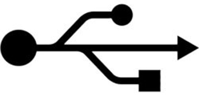
The logo for the USB devices we all know and love is under attack from a Brazilian people (heh). They claim the USB logo shown here is similar to the Satanic trident/pitchfork thing. OMG WTF BBQ.
Click for the original article:
http://www.guardian.co.uk/science/the-lay-scientist/2010/nov/15/3
Sunday, February 27, 2011
Tuesday, February 22, 2011


Sunday, February 20, 2011
Sunday, February 13, 2011
Journal 3
The gist of Stefan Sagmeister (funny Austrian guy) was that happiness in a designer's life can influence the work of the designer. We can see sometimes the difference that happiness can play in designs.
3. Strive for happiness
Not only can happiness by expressed in a design, but also it can evoke happiness in the viewer. This can make life more pleasurable and interesting, like the subway signs regarding the rules of life. So life doesn't have to be all serious and dull.
I found it interesting that if I would take my eyes off the screen for a time, say, to type up some notes, that it was very easy to pretend I was listening to the other Austrian guy (Arnold Schwarzenegger). And that thought also made me smile.
On the "How good is good" page I especially liked this priority list:
1. Help others
2. Don’t hurt anybody3. Strive for happiness
I think this list could help people stay focused and less selfish in a confusing world. But as a designer, it is a good question, because HOW CAN I DO THIS? With a graphic of all things. So we'll see. I think the reason Sagmeister is so popular because he makes people feel better and more hopeful for the future. This can be hard to find. I think I would ask him how other facets of design could be improved with this concept of positivity.
Additionally, I was interested in JJ Abrams video, which wasn't super designy, but still full of useful concepts. The mystery box was a pretty cool idea and I loved the retro feel of the question mark.
The other video I checked out was about caves, which is something that I like but I don't think I could ever get into a really tight cave. I would probably go into a huge cave, or one with tunnels the size of a bedroom, but otherwise, nope. Not me.
Additional Audience Persona
Persona #2: Biff Wellington
Biff Wellington is a high school student in a rural town in rural Ohio. Mr. Wellington comes from a middle class family that is largely conservative in most respects. Biff is an outcast at school and feels more at home in a library rather than he does at home. He is a passive aggressive young man with aspirations of being well-liked and athletic, however, the chances of this becoming true are not good and deep down he knows this. His passive aggressive nature is apparent in his weak school performance and his overly sullen attitude towards everybody.
What he does well, though, is read. He reads about 3 large novels a week and his interests are mainly genres one would expect a high school boy to read: Horror stories, crime novels, and quite often war stories. Because of his dreams of becoming well-liked and athletic, he finds himself living vicariously through these war stories, especially ones that have a hero in them, a hero whom everyone loves. He often picks books out from the library based on how "cool" the cover is, often not even taking the time to read the synopsis on the back or flap. For Christmas he received a "Kindle" which is an electronic book reading device. He often purchases books online to read on this device, but he still reads traditional books also.
Persona #3: Emma Royds
Emma Royds is a house wife in Texas with 3 kids, a balding husband and a cat named Elvis. She is the only person in her household that doesn't watch TV constantly. She used to be a tomboy as a kid but now she makes some effort to be more ladylike. Mrs Royds thinks she might be into women, but never had the chance to find out. She drives a beat up Bronco and wears cowboy boots. When she does watch television, it is usually something like Walker: Texas Ranger or some other action show or movie. The books she reads often speak about the male identity (ie: fighting, drinking, farting, etc) and very often are books about war and cowboys. She has read a lot of classic novels by authors like Louis L'Amour and John Steinbeck. She is pretty discriminating when it comes to finding a book to read and sometimes she goes a month or two without finding anything worth her time. She picks her books by the cover and then reads the synopsis to find out if it might be good. Sometimes she reads reviews online before making a purchase.
Wednesday, February 9, 2011

Reviews For "The Thin Red Line"
"ONE STEP AWAY FROM SHEER, HOWLING MADNESS"
- New York Post
"Future generations will look back on this as a definite statement of human combat in our time"
- Life
Tuesday, February 8, 2011
Audience Persona and Concept Statement
Audience Persona
Samson is a semi-retired truck driver with mediocre health, two grown children and an estranged wife. In his sixtieth (and current) year he has dealt with his advancing age and growing weariness for life. Despite this weariness, he finds time to shop at Cabela's for hunting and hiking trips he never takes and shops at WalMart every weekend, regular as clock-work. He enjoyed Pong as a younger man, but only plays Bejeweled (tm) now. As he gets older he becomes more nostalgic and his interest in history becomes more than just an occasionaly activity, but a full blown hobby. To this end, he watches the History Channel often and occasionally will read a book.
Samson is thinking about getting an online degree in military history, because he never did anything school-wise after high school. The older Samson has become to more he stays home and the less he spends time with friends. When he is at home he watches TV or reads, sometimes doing both at the same time.
Several times a year he will go on a long haul run with a newbie. He worked with his company for almost 40 years, but now he only goes on runs as a sort of instructor for the new hires. During these excursions he eats way too much fast food and reads at least 4 hours a day.
Because of his interest in military history and his ability to read, he often reads old WWII stories that he can pick up cheap at Half Price Books.
Concept Statement
The story "the Think Red Line" is a powerful tale of the men of C for Charlie Company, part of the effort to claim the island of Guadalcanal during WWII. In the dark, and deadly, jungles of this Pacific Ocean island, these some 60 men with find in themselves a war of their own: Overcoming their own fears and doubts, wrestling with the possibility of screaming, bloody death, coming to terms in a thick rain of deadly mortar and machinegun fire. The story by James Jones focuses on the struggle each man must face on the battlefield of their mind, while they struggle on this forsaken rock in the middle of the Pacific at the beginning of a long and bloody war.
Monday, February 7, 2011
DESIGN! STUFF!!
Typography Word List
Thin Red Line Book Project 1
grim, stark, powerful, lonely, gripping, tragic, dreary, sad, compelling, compassionate, heretical, significant, deep, moving, poignant, hideous, coarse, cadaverous, horrible, intellectual, Exquisite, brawny, crass, clever, observant, fatuous, honest, straightforward, foul, infamous, tactile, terrifying, heroic, desolate, brave, unique, tempermental, familiar, idealistic, honorable, agnostic, depraved, corrupt, degenerate, Blasphemous, Skeptical, exemplary, contradictory, reverent, amiable, Cynical, scared, anti-social, ribald, altruistic
Definitions:
grim: ghastly: shockingly repellent; inspiring horror
tragic: very sad; especially involving grief or death or destruction
Poignant: keenly distressing to the mind or feelings
cynical: believing the worst of human nature and motives; having a sneering disbelief in e.g. selflessness of others
Blasphemous: grossly irreverent toward what is held to be sacred;
Stark: blunt: devoid of any qualifications or disguise or adornment
tactile: tangible; perceptible to the sense of touch
agnostic: uncertain of all claims to knowledge
depraved: deviating from what is considered moral or right or proper or good;
Altruistic: showing unselfish concern for the welfare of others
Sunday, February 6, 2011
Type Stuff
Typography Word List
Thin Red Line Book Project 1
grim, stark, powerful, lonely, gripping, tragic, dreary, sad, compelling, compassionate, heretical,
significant, deep, moving, poignant, hideous, coarse, cadaverous, horrible, intellectual, Exquisite,
brawny, crass, clever, observant, fatuous, honest, straightforward, foul, infamous, tactile, terrifying,
heroic, desolate, brave, unique, tempermental, familiar, idealistic, honorable, agnostic, depraved,
corrupt, degenerate, Blasphemous, Skeptical, exemplary, contradictory, reverent, amiable, Cynical,
scared, anti-social, ribald, altruistic
Definitions:
grim: ghastly: shockingly repellent; inspiring horror
tragic: very sad; especially involving grief or death or destruction
Poignant: keenly distressing to the mind or feelings
cynical: believing the worst of human nature and motives; having a sneering disbelief in e.g.
selflessness of others
Blasphemous: grossly irreverent toward what is held to be sacred;
Stark: blunt: devoid of any qualifications or disguise or adornment
tactile: tangible; perceptible to the sense of touch
agnostic: uncertain of all claims to knowledge
depraved: deviating from what is considered moral or right or proper or good;
Altruistic: showing unselfish concern for the welfare of others
Wednesday, February 2, 2011
Tuesday, January 25, 2011
Research for TYPE 2 Project 1
Notes
Signs Defined: Signs are representative of something whether it be danger, health, aircraft, food and so on. They can mean something other than themselves which is why they are so useful. Signs also depend greatly on the context, with which we can use to define the meaning of the sign.
Verbal Example: CD = Music
Index Defined: When there is a physical or causal relationship between the signifier and the signified, the non arbitrary relationship is said to be indexical.
Verbal Example: Smoke = Fire
Symbol Defined: Representation of something, whether it be an idea, feeling, organization, etc. something used for or regarded as representing something else; a material object representing something, often something immaterial; emblem, token, or sign.
Verbal Example: An elephant symbolizes great memory
This Means That: Summary and Notes
We live in a world of signs which are important in our society. A sign can be almost anything but what a sign signifies is dependent on the context. So a sign must always be dependent on context, never independent if it is to be understood. (e.g. high heeled shoes can either be sexy or crazy depending on the culture/context).
The apple in the Adam and Eve story could easily be another fruit (and is not mentioned as being an apple in the bible) but an apple was chosen because of it functions as a signifier. The apple signifies temptation and apparently is widely seen as such, therefore the picture of Adam and Eve has successfully communicated its message.
Braille as a signifier works as a system of dots or bumps that reflect letters which when combined create words. This is an example of how signs are composed of two inseperable elements: signifier and the signified.
The relationship is often arbritrary meaning we've picked any old word we could think of in most cases. To us casual users of a word we assume it is natural when in fact it isn't.
Inuit maps are a good example of how something that is real (eg - coastlines) can be represented with something abstract (carved wood). This to us westerners seems weird because we use paper maps or GPS devices but for the Inuit it made perfect sense. It is a good example of how we come to see these signs and signifiers as natural when they are products of our cultures and societies.
Sean Hall argues that with any ICON there is some degree of semblance between the signifier and the signified. (but how about "dog" i wonder...)
The woman in the picture seems to be dead which if it were really true would be somewhat horrifying or sad. In this case it is photographical representation. it is a simulation of death. Also, how can we be sure the woman is not dead? At this point Hall points out other examples of Sgfer and Sgfed.
The swastika (indian) which in this case is reverse from the nazi swazi is a symbol of good luck in some religions. It is ironic because the nazi one is a symbol of terror and death. So it is powerful example of how a symbol can represent nearly anything in the right context.
"I shop therefore I am" is a play on Descartes' "I think therefore I am" which is the only thing that he could not plausibly doubt. So, we can infer that shopping gives us identity and solidifies our existence, it is something that we can't doubt.
Mediums are the pathway for the message. We have Presentational, Representational and Mechanical.
Hall argues next that the Mona Lisa, when broken down and analyzed tells us that the window to the soul is not the eyes as previously claimed by everyone, but really the mouth. Because her eyes tell us very little, but her mouth says much.
With the choco-Cake scenario, we have no context to understand the statement, so we can guess from a number of possibilities. It turns out to be complete bunk as it was all a scenario (i saw that coming). But the lesson is clear: in these cases the person reading or what have you is the really receiving the message, not the granddaughter. So we have the "receiver" (me, the reader) and the addressee (that GD GD)
The ways of meaning: simile, metaphor, metonym, synecdoche, irony, lies, impossibilitity, depiction, and representation.
Which are the most alike: this is depedant on the person making the decision, what interests them the most. This is the essential way that simile works, the likening of one thing to another. They can exist in visual communication as well as verbal.
Metaphors: How is a beautiful woman like a bottle of expensive perfume? They are both expensive?
No! They both possess beauty and elegance apparently.
Objects can represent concepts: Statue of Lib = Freedom
Images can Represent Causes, Persons, Places
Words can represent events, activities, concepts also.
ELVIS is recognizable for his very unique hair styles, esp. when they are all together. So, this part of Elvis, that is really pretty lame, (hair?) can make us immediately think of ELVIS. THis is a synecdoche.
Note: I will link to PDF version of notes that include pictures (to save space)
Monday, January 24, 2011
Book Possibilities
The possible choices for our first project.
- The Thin Red Line - James Jones
- The Invisible Man - Ralph Ellison
- Heart of Darkness - Joseph Conrad
Subscribe to:
Posts (Atom)